
With the increase in the demand for responsive design in the web industry, clients often are willing to pay more for a responsive website rather than a dedicated native mobile application. Several frameworks are available for making your website responsive but bootstrap is the most commonly used CSS framework.
Not only it does provides the feature of adapting the device in which the website is loaded in, it also substantially reduces the time and the effort that is being put in by the developer. The old and traditional CSS Media Queries needed to be applied and most of all cross browser compatibility created a lot of issues. A website when loaded in firefox and chrome works beautifully but when you try to open it on an apple device, specially in the safari browser, the layout starts to distort and what you see is not what you actaully accepted.
Bootstrap has been like a life save in such situations where cross platform applications were to be created. Now you do not need a mobile application dedicatedly for android and iOS devices, instead you can create a responsive website which works flawlessly on every device.
Developers are mostly using the bootstrap admin themes for creating backend modules for their applications.
Looking for a free theme to start your responsive web development journey?
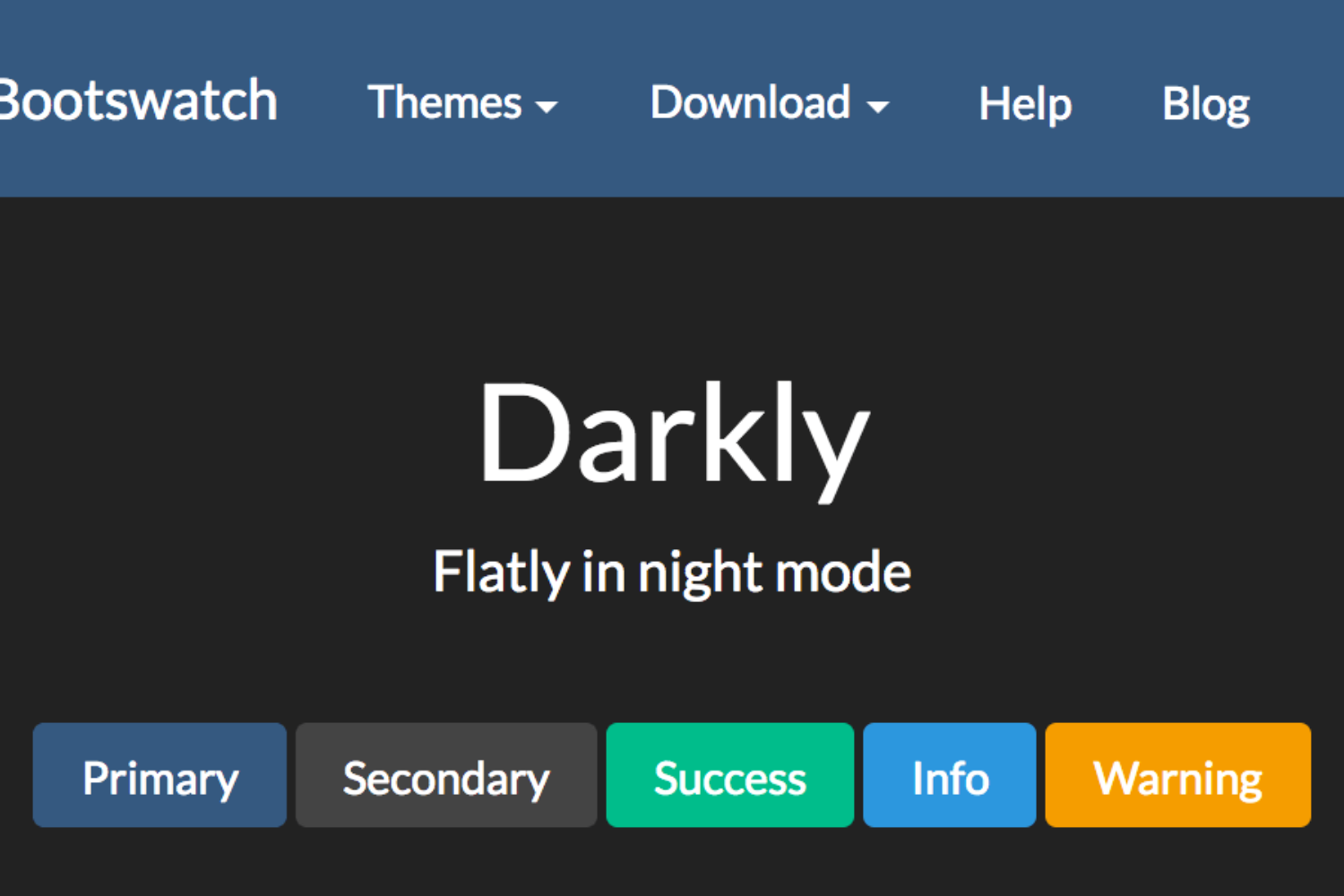
Bootswatch is one such website which provides you free bootstrap themes which are easy to install, customizable and also are up to date with the latest Bootstrap V4.2.1.
What do you use for making your website responsive?