Most business owners spend months obsessing over the wrong problem.
They test new colors. Redesign the hero section. Swap out the stock photography. Hire a copywriter to punch up the headline. And when the leads still do not come, they assume they need a bigger marketing budget or a better offer.
They almost never look at the number of choices they are forcing on their visitors.
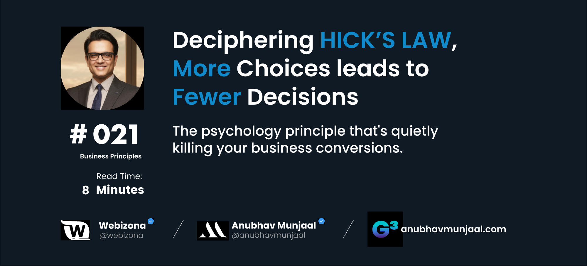
In 1952, psychologists William Edmund Hick and Ray Hyman ran a deceptively simple experiment. They gave participants a set of options and measured how long it took to make a selection. Then they added more options and measured again. The relationship they discovered was so reliable and so consistent that it became a named law in cognitive psychology.
Every time you double the number of choices available, the time it takes to make a decision increases by a fixed, predictable amount. Not a little. Not proportionally. Logarithmically. The human brain does not scale gracefully with complexity. It stalls.
They were measuring response times in a lab. But the same mechanism governs every person who lands on your website at 10pm, phone in hand, trying to figure out whether you are the right person to call.
The moment they have to choose what to do next, you have already started losing them.
Here is what Hick’s Law looks like in the real world. A homepage with six different service offerings, each one described in equal detail, each one pointing to its own page. A navigation bar with nine links and a dropdown that reveals four more. A contact page with a form for general enquiries, a separate form for project briefs, and a calendar embed for discovery calls — all three options sitting side by side with no guidance on which one to use. A pricing section with four tiers, a toggle for monthly and annual billing, and a twelve-row feature comparison table stretching below the fold.
Every single one of those decisions lands on the visitor. And the visitor did not come to your site to make decisions. They came to find out if you can solve their problem. The moment you make them work to figure that out, the cognitive load tips past the point of comfort, and the easiest available action becomes closing the tab.
This is not a failure of intent. It is a failure of sequencing.
Most business owners add complexity because they are afraid of leaving something out. They have multiple services, so they show all of them. They have multiple types of clients, so they address all of them simultaneously. They have multiple ways to get in touch, so they present all of them with equal prominence. The logic feels sound. The result is a page that tries to do everything and ends up doing nothing particularly well.
The websites that convert consistently do not succeed by having more. They succeed by making the next step impossible to miss.
One primary action per page. One headline that answers the single most important question a visitor carries when they arrive. One path from the moment of interest to the moment of contact. Not because simplicity is a design preference. Because simplicity is what the human brain can actually process under the conditions of a first website visit, which is low trust, low patience, and high competition for attention.
I audited a real estate investor’s site earlier this year. The homepage had a headline, a subheadline, a hero image, a brief about section, three service descriptions, a testimonials row, a recent deals section, a newsletter signup, and a contact form — all on a single scroll. It had been built with genuine care. The design was clean. Everything on it was relevant.
He was getting two leads per month.
We stripped the homepage down to a single question and a single action. Who are you trying to reach, and what is the one thing you want them to do when they arrive here. Everything that did not serve those two things was moved, reframed, or removed.
Within sixty days, eighteen qualified leads per month from the same traffic.
The offer did not change. The market did not change. The complexity did. Hick’s Law did not care about the quality of the content it was working against. It only cared about how many decisions the visitor had to make before they could move forward.
Your visitor is not disengaged. They are not uninterested. They are not the wrong audience. In most cases, they arrived because they had a problem that your business can solve. They left because you made it too difficult to take the next step toward solving it.
Every option you add to a page is a tax on attention. Every competing call to action is a reason to pause. And pausing, on a website, almost always becomes leaving.
Simplify the path. Everything else follows from there.